Client Case Study
Feature design alongside client
Responsive design translation from Figma files.
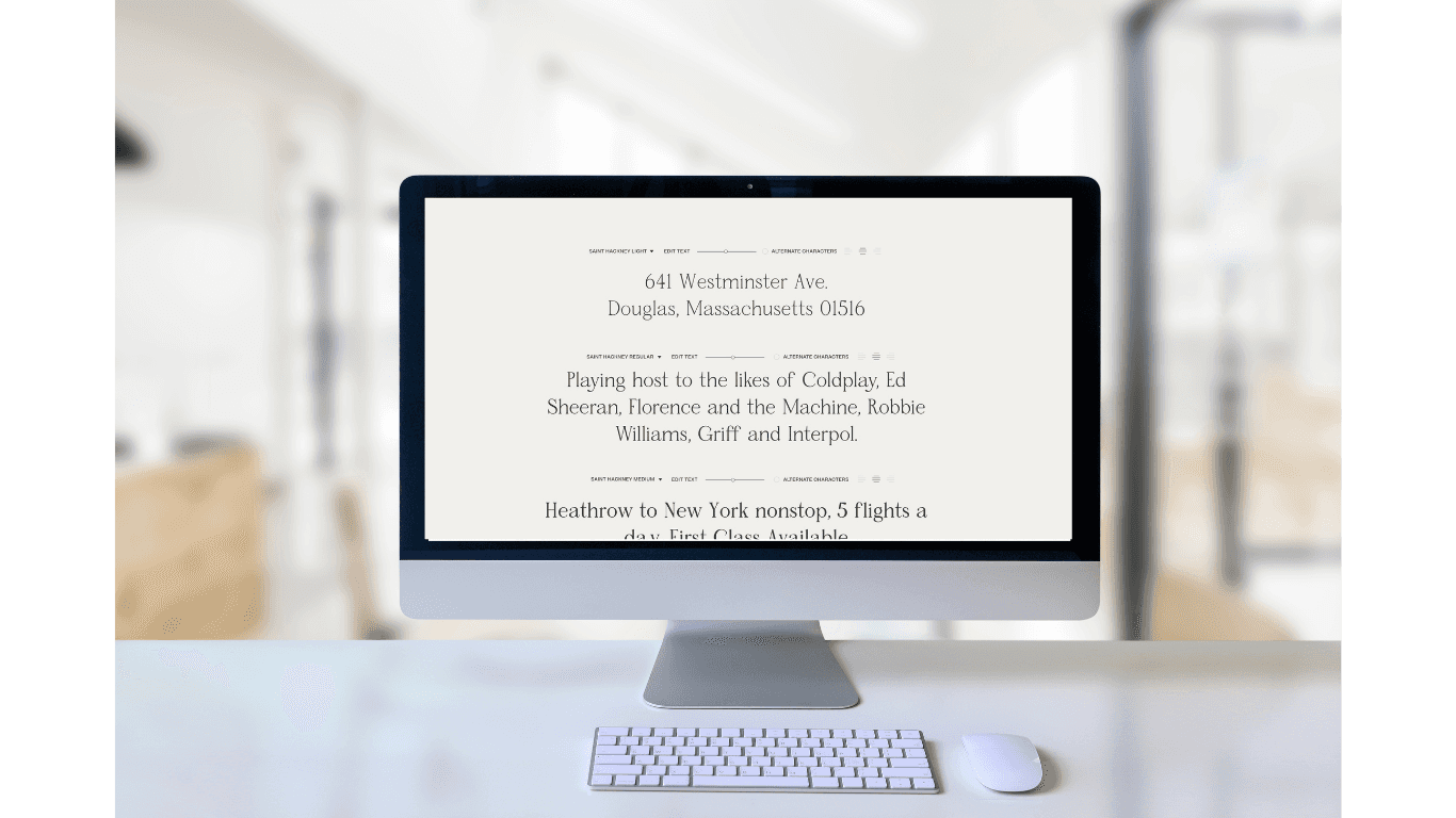
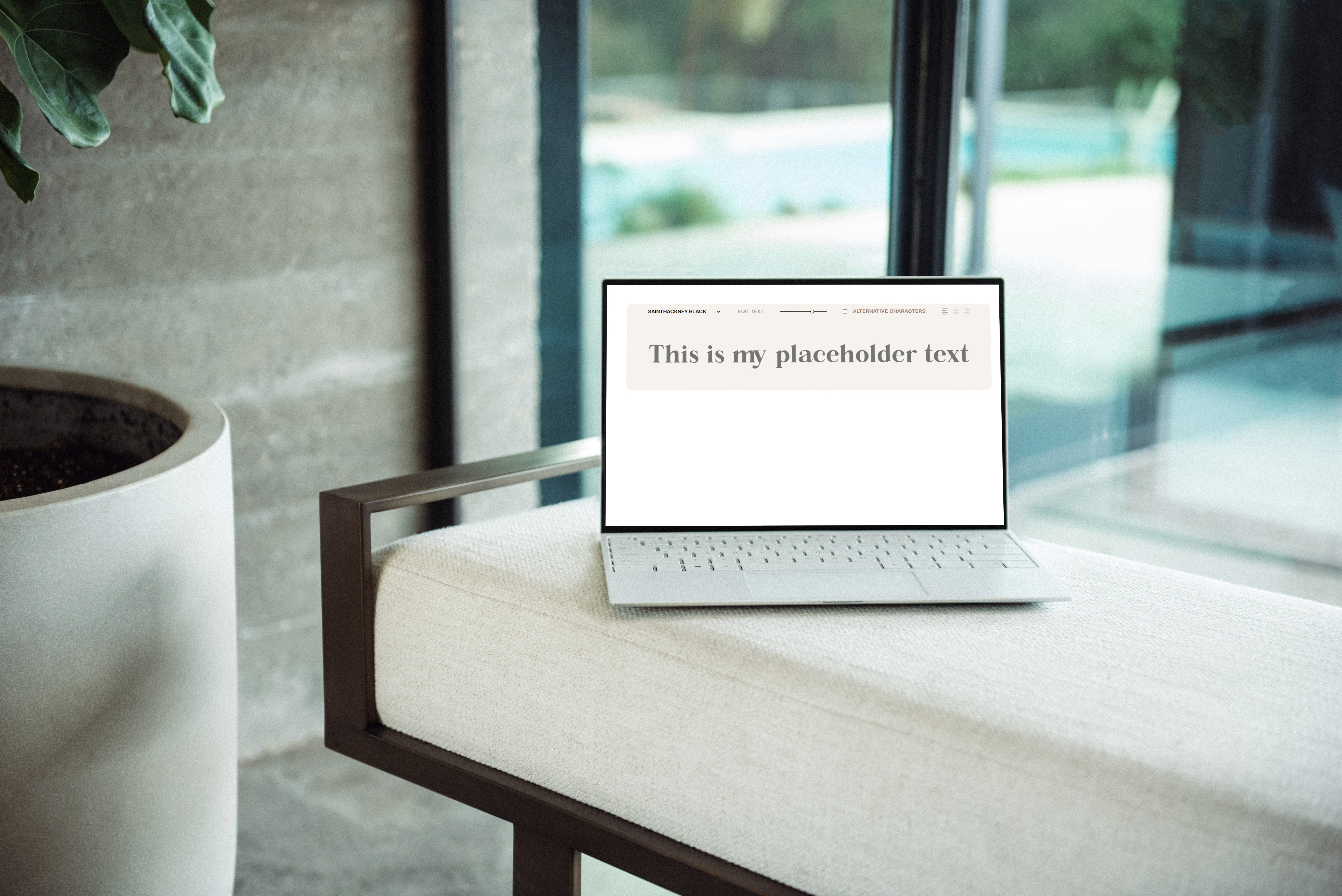
Event based logic for handling dynamic font previewing
Challenge
The app had a cluttered interface, making it difficult for users to navigate and find essential features. Users were facing issues with the onboarding process, which was affecting new user adoption rates. The app lacked personalization and customization options, making it less engaging and user-friendly.
Results
The redesigned app features a clean, clutter-free interface, making it easier for users to navigate and access essential features.The improved onboarding process resulted in a 35% increase in new user adoption rates.The addition of personalization and customization options enhanced user engagement, leading to a 25% increase in user retention rates.


